
Today’s post is by author and website designer Camilla Monk (@camilla_monk).
I come with terrible news for you: the average visitor spends on 54 seconds on a webpage, and more than half of them will visit nothing but your homepage.
That’s a pretty short window to turn visitors into readers, buyers, or subscribers. To make the most of those 54 seconds, you’ll need a visually appealing page that prioritizes your goals but also smart baits to scrape up just a little more of your visitors’ time and attention. Here are a few ways to achieve that.
1. Start with a great headshot
Before you even start building your website, I highly recommend getting headshots taken by a professional photographer. You’ve probably heard of the old saying, “Fake it till you make it”: that’s what a good headshot is for. You may not yet be a bestselling author, but you want to look like one to potential readers!
Many studios offer a few pictures at a reasonable price. If your budget is tight, you can try online services like Studioshot or ProPhotos, which rely on AI technology to enhance existing pictures and turn them into professional-looking headshots.
If you opted for a studio shoot, don’t hesitate to bring a few objects, copies of your book(s), or even your pet:. A good, sincere headshot that tells the story of who you are is a powerful way to connect with readers and prolong the brief attention span they’ll give to your website.
Lastly, having two or, ideally, three different headshots will avoid a sense of repetition on your website. Ideally, you should have one for the home, one for the bio, and one for the contact page.
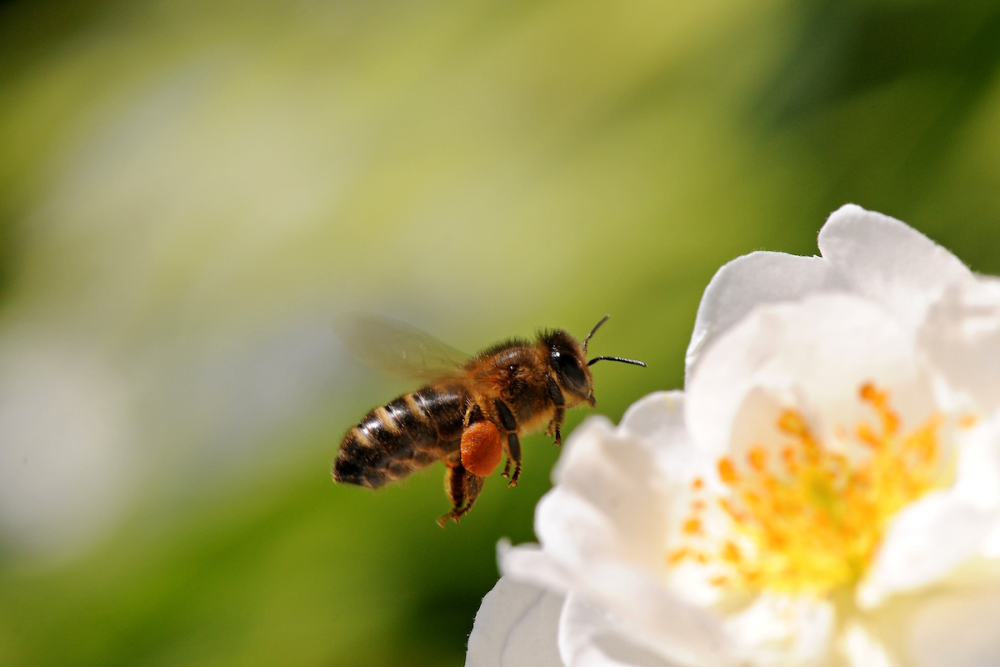
2. Bees like color
Think of your visitor as a bee: it’s buzzing erratically your way, drawn to a pop of color in the field: your website. A simple way to impress your brand and book into the retinae of potential readers is to give your homepage an intense, contrasted color scheme, with a pop of color if possible. Here’s an example with four color palettes:
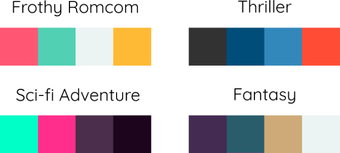
Visitors may or may not like these colors, but they’ll likely remember the website and form an immediate impression of the tone of your writing (frothy, dream-like, dark and unsettling, etc).
You can explore online palette tools (like this one) to find out what color scheme works best for your brand and books, or let yourself be guided by the work of whoever designs your book covers. For those of you using WordPress, it’s fairly easy to change the color scheme of a WordPress theme, so you could match your theme to the cover of your new release to draw visitors into your book’s atmosphere.
3. Use crisp images and illustrations
Here’s one of my biggest pet peeves: loading a website and being greeted by blurry, badly compressed images that make the whole thing look cheap. Make sure to create a folder where you keep high-resolution (at least 2,000px wide) author pictures and book covers that will be later resized by your website (or they should be). You want everything to look sleek and professional.
4. Outbound links: less is more
If you’ve created an author website to sell books, your first logical impulse may be to cram in as many retailer links as possible. After all, this is a gateway for readers to buy your stuff, and they need to find it!
True, except that in real life, visitors will scan your content in a matter of seconds, and if it’s crowded with too many outbound links, their gaze won’t settle on any specific one, and they may be less likely to click at all. Plus, how do we address the issue of international retailers with multiple stores?
The answer is to focus on the essential: figure out where you want your visitors to click the most, and lump the rest in a universal link: a single web page that lists all known retailers for your book, and, in some cases, tailoring links according to the visitor’s location. You can generate universal links to your books with services like Books2read, Booklinker, or even Draft2Digital.
If you’re traditionally published, you might want to prioritize your publisher, Bookshop and/or an independent bookstore you’ve partnered with, then have other retailers in a universal link for convenient access. Conversely, self-publishing authors may want to prioritize Amazon, especially those exclusive to Amazon, or where they have a promo running at the moment, then everything else goes into their universal link.
Whatever you prioritize, don’t overwhelm your visitor with a stack of five or ten buttons they can click. Steer their gaze where you need those clicks!
5. Consider the user journey
All your pictures, text, and retailer links are ready. Before you get started on creating your website—either on your own or with the help of a designer—take a moment to set a goal for your homepage, since it may very well be the only page your visitors will browse during their visit. What do you want to accomplish?
- Is this your first book, and you’re promoting pre-orders?
- Do you want email subscribers?
- Are you releasing a new book in an existing series, and you want to advertise it but also bring attention to previous titles?
- Something else?
Figuring this out will help you prioritize sections on your homepage and create a straightforward user journey for your visitors, unencumbered by visual noise or content that doesn’t help you accomplish your goals.
Say you have a new book available for pre-order, and you want sales. Don’t crowd the first half of your homepage with your recent blog posts, because that’s not where you want users to click first. Similarly, you might promote a new release with a focus on pushing people to retailers or just Amazon if you’re an indie author exclusive to Amazon.
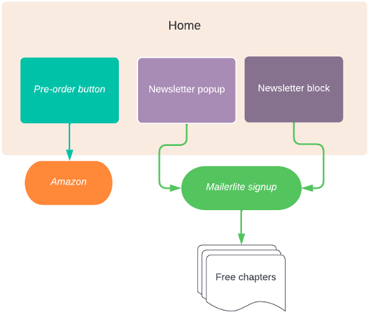
Here’s a quick example of how this might look in a diagram prioritizing my goals:
Another hypothetical: if this is your first book, and there’s no pre-order link yet, you might be after newsletter signups to promote your title once it hits the shelves. In this instance, you’re going to open with a headline encouraging visitors to sign up and get notified of your new release. Then below that, if you have a blog, showcase your writing until your pre-order is up.
6. Set up a reader magnet
A reader magnet is a reward for visitors who subscribe to your mailing list. Most authors will offer free chapters of an upcoming title, or even, in some instances, a free book or novella. If you have an online store, you can also offer a coupon for a discount on your books.
To create your reader magnet, you will have to configure your mailing list with an automation (or workflow, for Flodesk): one or several automated emails sent to new subscribers containing a link to download your free chapters, a coupon code, etc.
(Note from Jane: Author Ashleigh Renard has written about the power of a reader magnet and how to create an effective one.)
7. Add a newsletter subscription popup to your homepage
My fingers hurt just typing this because, as a UX designer, I loathe popups with a passion. I am, however, here to talk to you as an author who designs websites to sell books, and well … my subscription rate has skyrocketed since I switched to a popup newsletter form versus an inline form.
There is some debate as to whether leads obtained this way are slightly less qualified than readers who went to the trouble of looking for your subscription form with the express purpose of signing up, but I don’t believe the delta is significant enough to disqualify popup forms.
So toss your principles out the window and do it. I regret to say it works.
(Note from Jane: There are ways to create effective pop-ups that are polite and not intrusive. Here’s my experience.)
8. Always write a catchy excerpt for your blog posts
At 55 seconds, if your visitor is still on your site, they’re probably going to reach your recent blog posts. There are three factors to get visitors to click on those posts and spend a little more time on your website: a catchy title; a hi-res, adequately cropped, and visually appealing post image; and (the one most authors skip) a solid excerpt.
If you’re a WordPress user, you probably know that, by default, your post description will be the first 30 words of the content. Problem is, your intro may not always be concise or powerful enough for visitors to click on the post. So, scroll down to the excerpt field (in the sidebar of your post admin), and write some enticing copy.
To conclude this post, here’s a TL;DR of what we’ve covered today:
- Get professional headshots.
- Add distinctive colors to your website.
- Make sure every image is crisp.
- Outbound links: less is more.
- Prioritize calls to actions or content according to your goals.
- Set up a reader magnet for your newsletter.
- Add a newsletter subscription popup.
- Write catchy excerpts for your blog posts.
Camilla Monk spent over a decade in advertising, building rickety websites for financial companies before she turned her wiles to writing. She has since traditionally and self-published a six-book romantic suspense series, Spotless, as well a three fantasy titles. These days she shares her time between writing more high-octane nonsense and designing websites for book industry professionals.
Great Article. Thanks for this useful information.
Good info here! I’m in the process of beginning to market my first book, and checking to make sure I’ve got all 8 of these things down!
Thank you very much for this great post. It is always great to see recommendations on what a powerful author website should look like. My own website is a work in progress, and I keep looking for ways to improve it. Thank you again for such a useful post.
Excellent, practical tips. Thanks
Great tips. I’m already using half of them to promote new my book Destiny’s Daughter, Apprentice House Press. So now will add the rest. Met Jane at Maryland Writers conference.