Static websites are pre-built web pages that display the same content to every website user. Unlike dynamic websites, there’s no back-end database serving up personalized content based on what users do.
This means static websites have faster load times, cheaper hosting, simpler security, and fewer maintenance responsibilities than a dynamic site.
Though the content on a static site is “fixed” content, it doesn’t have to be motionless or dull. You can still add forms, videos, and effects. Of course, there are limitations with static sites, but clever developers can usually find workarounds to get exactly what they want.
Let’s take a close look at nine static website examples that are extremely effective for a range of business use-cases.
In each example, I’ll call out the static site generator or website builder used in each example and highlight specific page elements to serve as inspiration.
Note: Beginners will have no trouble creating a simple static website with a website builder like Wix. It’s all point and click, you won’t need to code anything. There is a lot more to know if you want to create a complex site using a static site generator.
1. Freelancer Static Website Example: Sophie Brittain
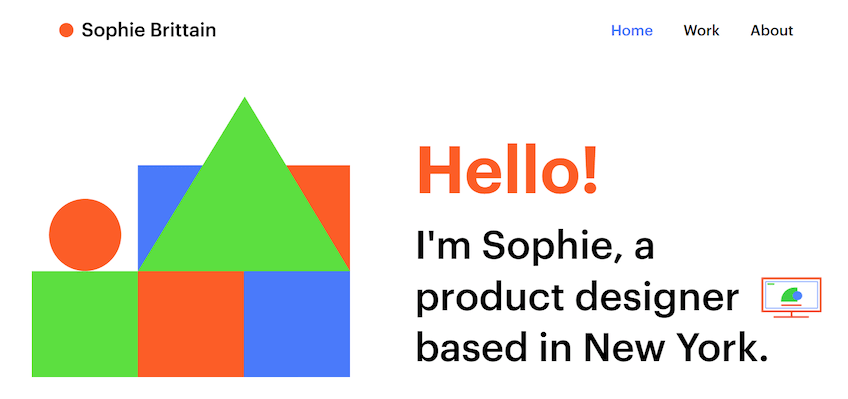
Built with Wix
Sophie Brittain, a freelance product designer in New York City, has a polished static website that showcases her work and makes it easy to get in touch.
The site is super simple. We’re talking two pages, four colors, a couple mouseover effects, and less than 500 total words.
But there’s nothing missing.
The focus of the site is her past work, which is captured in high quality images. There’s nothing inventive in the way it’s arranged, but it’s clear that she has completed demanding design projects for big brands.
We take a real close look at the website of any freelancers we hire on Quick Sprout. Maybe we’ll take a peek at a resume (maybe), but we are 100% checking the website of any writer, designer, developer, or other contract role we need to fill.
If you are a full-stack developer, a dynamic site is a great way to showcase your abilities.
For anyone else, complex page elements are probably going to take the focus away from your work.
2. Educational Static Website Example: Modern CSS
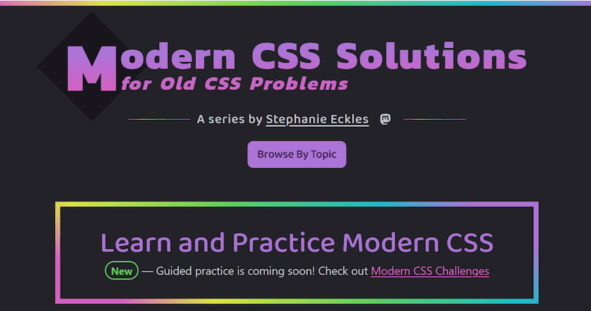
Built with Eleventy
Modern CSS is a static website with tons of tutorials and guides for web developers. It’s built and maintained by Stephanie Eckles, an engineer/educator with a passion for front end development.
Evidence of Stephanie’s skill with CSS is everywhere on this site, from the unique layout of individual tutorials to the rainbow highlight mouseover effects. She obviously knows her stuff.
Getting deeper into the lessons you’ll find beautifully arranged content explaining exactly how to recreate the desirable website appearance for yourself.
There are some well-placed ads on this site, which probably provide a little bit of income. But with education websites, typically it’s the paid content (courses and other digital assets) that drive revenue.
In that regard, Modern CSS is truly a standout as all of the content is free. Wow. I’d highly recommend checking it out if you plan to do any hand coding on your static site.
3. Portfolio Static Website Example: Johannes Arnold

Built with Publii
Static websites make an excellent home for portfolios. In our featured example, photographer Johannes Arnold successfully displays his work by keeping the site clear and easy to navigate.
I like that he doesn’t have a separate page for his portfolio–the main page is it. You can click on the images and go to a separate page with a larger gallery for each project.
There are no distractions from Johannes’ photography. Images and a few videos are the only thing breaking up the white space. No colors, background effects, nor other page elements to get in the way. The only text longer than a caption is on his about me page.
For some web designers, perhaps the website is the portfolio where you show off exactly what you can do.
But for the vast majority of people trying to share their work, the website is just the shelf that displays past work. A simple shelf is fine–you want people to concentrate on your portfolio, not the site.
4. Multilingual Static Website Example: Let’s Encrypt
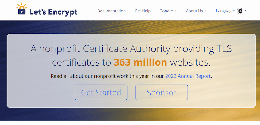
Built with Hugo
Wait, aren’t static sites bad if you want to have more than one language?
Yes, I would say most of the time it’s not going to be your easiest option. But say you have a ton of traffic from all over the world and you want a multilingual static website–it’s tricky, but it can be done.
Let’s Encrypt is a certificate authority that provides free, automated SSL certificates for more than 300 million websites around the globe.
Now, when you have to provide an essential service used by millions of people, you need a website that can scale–a simple static site makes perfect sense.
Knowing the difficulties, Let’s Encrypt worked with the static site generator Hugo to create a multilingual static website. You can view the results for yourself to see how they did it.
There’s a languages button with an intuitive icon which provides a drop down of 27 different languages.
Clicking the translation simply directs you to a new page (letsencrypt.org/ko, for example, for Korean) which features the same site but in the desired language.
Let’s Encrypt would spend a ton more money and time on a dynamic site. As a nonprofit with an incredibly high-traffic online destination, using a leaner and more efficient static site is definitely the way to go.
Working with Hugo, Let’s Encrypt was able to keep the static site everyone loved and make it accessible to millions more people.
5. Business Static Website Example: Martin Container

Built with Gatsby
Martin Container sells, rents, and leases refrigerated and dry storage containers on the west coast of the U.S. They use a static website to attract new customers.
The company builds credibility in the usual ways by showcasing their product and using testimonials from happy clients.
There’s nothing fancy going on, but it is a step above basic. It’s not just a photo of a trailer, it’s a short gallery that lets people see it from multiple angles. There are nine logos from major clients and four written testimonials to click through.
This is hardly an outrageous amount of content to feed into a static site generator. Your business certainly doesn’t need multiple locations or half a century in business like Martin Container to be able to put up a few dozen images and handful of client testimonials.
It’s a mistake to think you need flashy design to make a good looking website. You just need to hit the fundamentals and keep it clean.
6. Agency Static Website Example: Wieden Kennedy

Built with Gatsby
Wieden Kennedy, the advertising giant with clients like Nike, McDonalds, FIFA has a lively website built with Gatsby.
The entire above the fold section is a video that highlights their latest work, and as you scroll down there are more animated page elements and mouseover effects.
The W-K homepage is a great example of a static website with lots of movement. Yes, every user is going to get the same experience (i.e. there is nothing dynamic), but it’s a far cry from what many people think a static website can do.
Along with the animations and effects, there were a number of other details that I thought worked very well. For instance, W-K has their office locations listed in the footer with live clocks that show the local time. Did you notice the blacked out clocks for the locations that are outside business hours?
7. Nonprofit Static Website Example: Digital Democracy

Built on: Jekyll
Digital Democracy is a nonprofit organization “working at the intersection of human rights and technology.”
Their website shows what they have done, shares their tools, and makes it easy for people to get involved.
Evidence of their past work is captured in simple page elements: high-resolution images, concise text blocks, giant numbers drawing attention to “70 projects in 38 countries.”
There are multiple options to donate or join the community. With all the whitespace and simple color scheme, the plain orange donate buttons stand out without being obtrusive.
It’s important to capitalize on these small moments where someone googles an organizations’ name or winds up on their site via social media.
People want to be a part of something real. Show them exactly what the nonprofit has done and where it is headed. No frills necessary–a nonprofit doesn’t win bonus points for spending resources on a snazzy website.
8. SaaS Company Static Website Example: Cypress.io
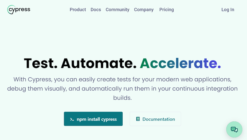
Built on Astro
Cypress.io, a front end testing company, nails the fundamentals and puts a unique spin on their product using a static site.
But Lars! There’s a chatbot option on this site–how is that on a static website?
Well, if you inspect the element you find that it’s an iframe, which means the chatbot is actually on another (dynamic) website that processes the visitor inputs. Yet another “limitation” of static sites that devs can work around pretty easily.
Along with the chatbot, Cypress.io has all of the fixings one expects from a SaaS website arranged in the navbar–product, pricing and so on. Below the hero text are buttons to download the free forever testing app and documentation to use it. A nice touch, though hardly unique in SaaS.
Overall, the above the fold area of the site is generic, credible, and instantly legible to anyone who has bought software.
Every SaaS website does about the same thing–and that’s okay. Buyers are looking for a few key things and they want to be able to quickly compare their options.
The rest of the homepage covers how the product works with a video followed by a scrollytelling style product walkthrough. Scrollytelling is too cute for me, but the focus on how their product works is smart.
The minimum paid plan for Cypress comes with 10k test runs per month. Small efficiencies for collaboration and testing management add up quickly. Potential buyers definitely want to see how it drives compared to other products.
9. Knowledge Base Static Website Example: U.S. Website Design Systems
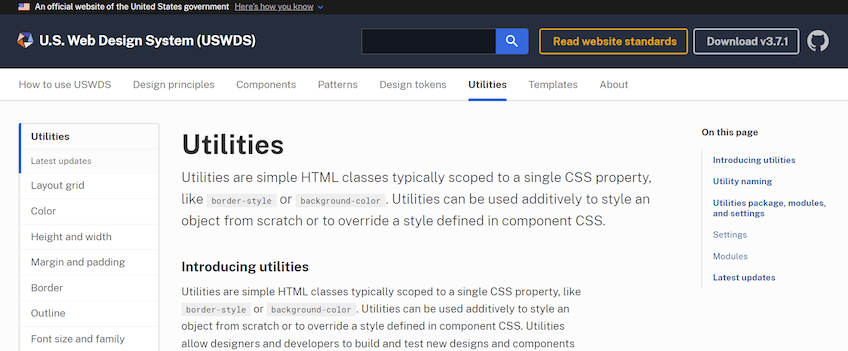
Built with Jekyll
U.S. Web Design Systems (USWDS) publishes a knowledge base to help other government agencies make their websites more accessible, valuable, and secure.
In short, they provide code for developers, wireframes for designers, and guidance to help other government agencies build better websites.
It is a very generic knowledge base website, in a good way. The navigation scheme is recognizable. Information is organized in an approachable, logical way.
Ideally, documentation won’t need to change often, which means a static site should work well. But it’s not necessarily true for every company’s knowledge base.
If you have constantly evolving processes, as we do on Quick Sprout, you probably want to use more traditional knowledge base software that makes it easier to edit, collaborate, and publish. For us, right now, a static website would be terrible as a knowledge base.
But for large companies, and certainly for the US government, the tools and processes captured in the documentation should have a long shelf life.