If you’ve ever landed on a company’s website and had no idea what it actually does, or if you’ve ever wanted to go back to a website but couldn’t find it again because the name or brand wasn’t memorable enough to stand out, then you’re not alone.
With over 200 million active sites online, it’s no surprise that many company websites look and sound the same.
Well, we’ve been taking a look around the block searching for company websites that actually make a statement, and honestly there weren’t very many that we found and liked.
That said, we did find some that do a really good job of feeling somewhat human by putting the users first, and these websites may provide a good example to follow when building your personal brand and taking it online.
7 Exceptional Company Website Designs
Figma
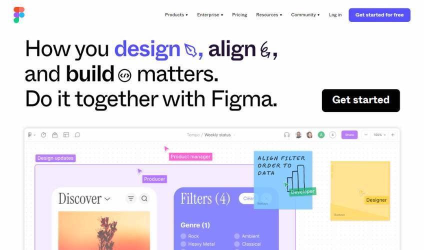
It’s no surprise that Figma is able to put together a great website. It’s a web design collaboration app, and its homepage is a reflection of everything its users love about it.
The website is interactive, playful, colorful, and innovative. Each animation makes you feel like you’re involved in the creative process, putting you in the driver’s seat and breaking down a barrier to purchase.
The idea here is that Figma wants you to try its product, so making its site interactive gets you halfway there.
At the same time, the website is also fast. Many of its animated sections are revealed upon scrolling, and this helps the site load quicker and creates a smoother experience. Next, as the background changes colors, it brings your attention to the next cool feature.
Despite all the moving parts, Figma’s sans serif typeface remains legible in various sizes throughout the interactive images, and its bright colors make it easy to distinguish between all the shapes and frames.
You also can’t miss Figma’s clear calls to action, as the big black buttons stand out against the changing background colors whenever you scroll. Meanwhile, the blue floating Get Started For Free button sticks to the top of the screen on certain desktop resolutions, giving you a constant opportunity to sign up.
And let’s not forget the huge CTA above the footer—that absolute chonker is impossible to miss. Under normal circumstances, having one element be sized way out of proportion with everything else on the page would be frowned upon, but in Figma’s case it’s bold and it works.
If you have a SaaS product, you can follow Figma’s lead by finding ways to make your users feel like they’re already using it before they sign up. It’s a very impressive and effective design.
Starbucks
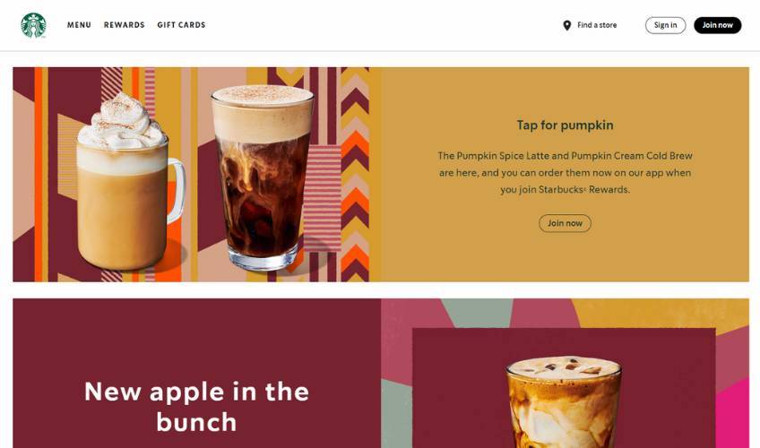
There’s nothing overly complex or flashy about Starbucks’ website, but it does do all the important things right.
Starbucks takes a mobile-first approach to design, assuming that its coffee-fueled visitors will be on-the-go or perhaps standing in line at the counter. The result is an undemanding and inviting brochure that nudges you to join its member rewards program and order newly released drinks via the mobile app.
Meanwhile, even the desktop version is stripped down in a good way for faster loading times. It uses color-blocked sections and minimalistic layout so that the drinks will look good and the messaging remains focused.
There are many benefits to keeping your website clean like Starbucks, especially if the majority of your customers interact with your company in a store.
First of all, you won’t have to spend too much time and money creating rotating copy or developing fancy effects. With a simple site, it’s enough to use good imagery and change it out seasonally and for new product lines. Many large ecommerce brands take a similar approach and succeed with it.
Secondly, a clean website also makes navigation options more natural. Starbucks puts the three most important actions in the top-right navigation area—Find a store, Sign in, and Join now. This navigation pattern is easily recognizable and helps customers get what they need without wasting time.
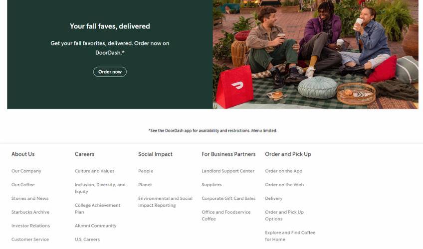
Starbucks also does a good job of segmenting the rest of its business touch points in the footer section. The more complex links are clearly laid out in the footer with large areas of whitespace between each link.
At the same time, each navigation subheading separates the information based on the specific category or audience. This is a smart move if you have many different kinds of people visiting your website.
Take a page from Starbucks and help your audience find what it needs as easily as possible.
Shopify
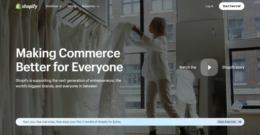
Not only is Shopify one of the top ecommerce website builders, it also has an exceptional website itself.
Like many of the other brands mentioned in this post, the key to Shopify’s success lies in making its website simple and personable.
First, Shopify catches the user’s attention with a full-screen video background on auto-play. We generally don’t recommend doing this without including a way to pause the video, but in this case it loads fast and tells a multifaceted story of its customers right away, so it might work for many people.
If you include a video in your hero image like Shopify, just be sure to make sure that it’s relevant, that it uses a color overlay to keep any text legible, and by all means that it gives the user a way to pause it.
Next, notice how Shopify draws your eye to its main CTA with a floating/sticky navigation menu. This is a clever way to keep users from getting lost while also providing them with constant access to signups.
And if you still need convincing, the rest of the homepage uses a combination of interesting layouts, facts and/or figures, and vibrant lifestyle images to draw you in.
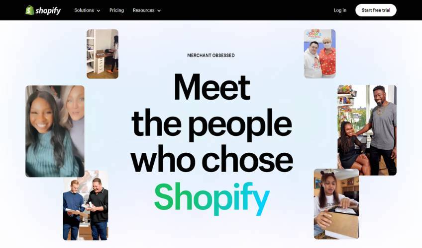
Even though Shopify is already a household name for many, its website pulls out all the stops and tells a compelling story about its platform and the sellers who use it.
For your website, think about how you can take advantage of stories to create a strong connection with your audience from the very start.
Intuit Mailchimp
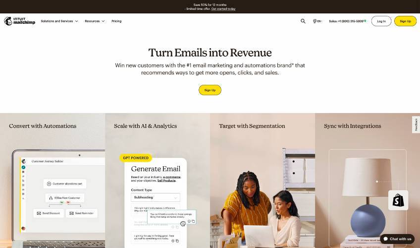
Most people know Intuit Mailchimp as an email marketing software positioned for small to medium-sized businesses.
While other email platforms grab your attention with standout features, Intuit Mailchimp wins with its simplicity. The website doesn’t focus on the technology behind the curtain—it focuses on the solutions it provides for real people.
The simple design elements of Intuit Mailchimp’s website work in tandem to create a calm, confident, and professional appeal. The retro-inspired typeface in the heading creates a sense of warmth and familiarity, which is further enhanced down the page by soft color-blocked sections and clean lifestyle imagery.
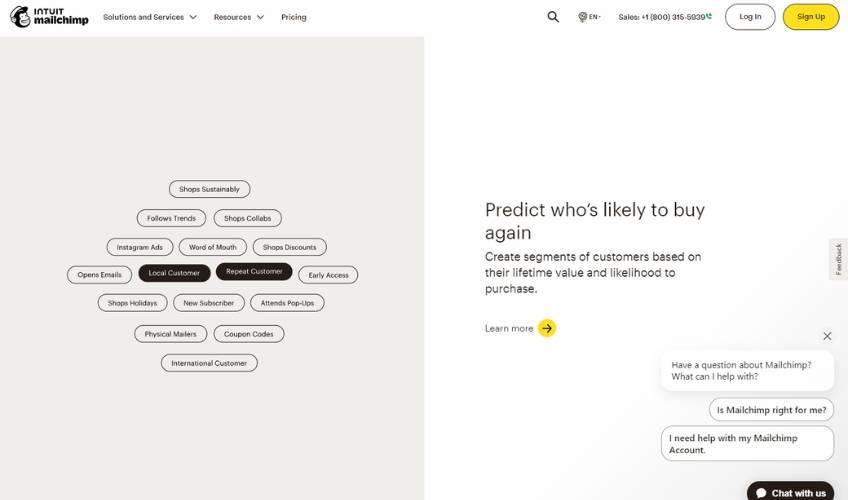
The bright yellow calls to action are the only colorful items that pop against the subdued backgrounds, so you know exactly where to click when you need to. When everything else is understated, nothing is overpowering.
If you have a technical product, you can take a cue from Intuit Mailchimp’s website and think of ways to humanize your website. Try to be as clear as possible and use subtlety in your design to set visitors at ease.
The Ocean Cleanup
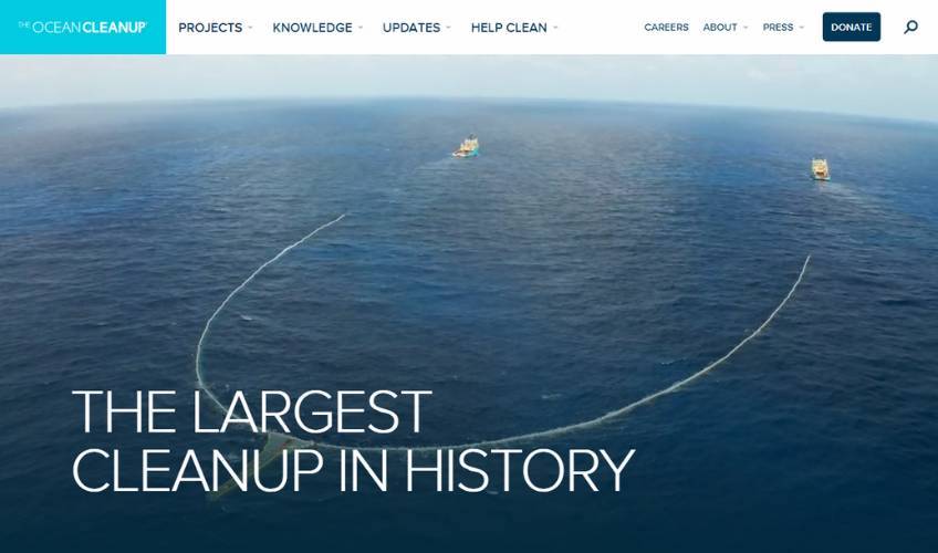
The Ocean Cleanup’s website proves that a nonprofit doesn’t need to have a super flashy or innovative website to make a significant impact.
Sure, it has full-screen videos, scenic stills, and a history of successful projects to showcase, but the overall layout remains simple and digestible. There’s plenty of well-utilized whitespace and each section serves a clear purpose.
If you have a lot of information to present on complex issues, or if you’re on a tight budget and don’t have any web development help, you could start by building your website on WordPress. It has hundreds of designer templates that you can use to get a similar look to the Ocean Cleanup, but in your unique style.
Once you’ve got the look nailed down, you can then concentrate on your website’s content structure and organization.
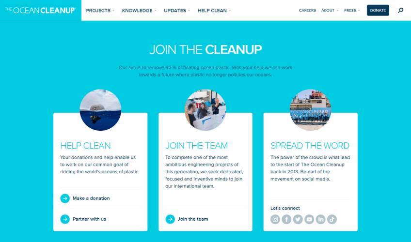
Take a cue from the Ocean Cleanup and be sure to show the problem and the solution to educate and motivate readers. Be sure to use graphics, charts, and data where necessary, but remember that the flashiest site isn’t always the most effective.
If you can tell a clear, convincing story, you’re doing your job.
Spring Health
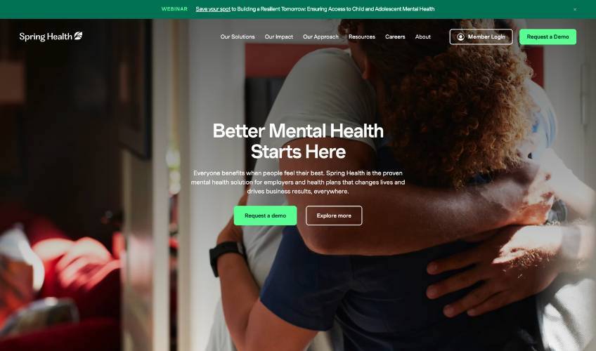
Spring Health keeps the theme of simple yet effective sites going by creating a compelling case for mental healthcare in the workplace without too many flashy features on its homepage. Sure, there are more interactive websites out there, but this one stays clean and clinical while still being friendly.
Plus, given the context of the service it offers, it’s probably way more effective to connect with users on a sincere level rather than wow them with gimmicks or vague statements.
Design-wise, Spring Health’s color palette is youthful and vibrant, while still maintaining a professional feel. The darker green plays to the themes of health and wellness, and the bright green buttons and accent text are trendy and rejuvenating. There’s also a pleasantly unexpected bright orange text highlight effect.
As for the main text, the large sans-serif titles anchor you to the messaging while clean, clear, and attractive images of diverse workers show that this company puts people first.
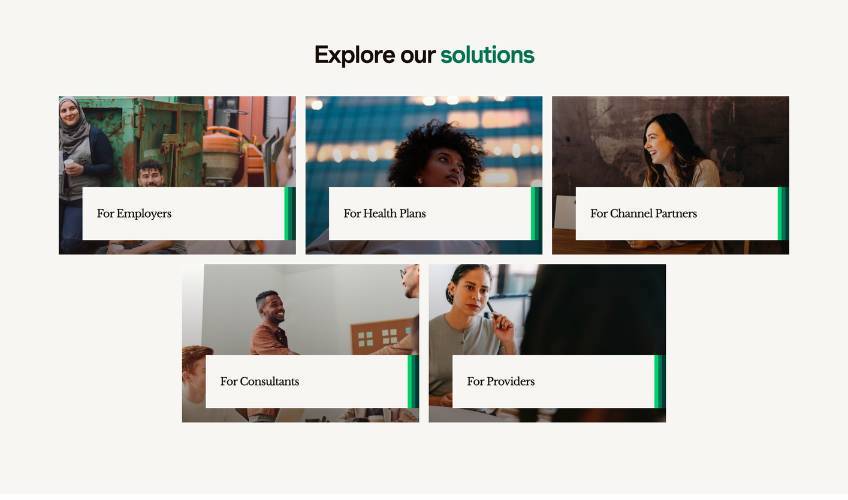
Spring Health does a good job of segmenting its audience in its design so that readers can get the information they need to navigate effectively. Each audience has its own landing page built upon the same template as the homepage. This structure provides an opportunity to create targeted messaging to convert different visitors with different campaigns.
If you’re using a similar tactic, be sure to change the wording of your landing pages to make them relevant to each audience. This will show your visitors exactly how you can help them, while also helping you avoid duplicate content penalties in search engine results.
Notion
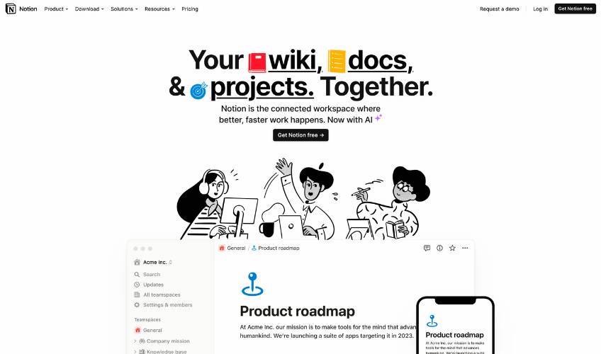
Earlier, we saw how Figma uses bright colors and interactions to make people feel they’re already using the platform. Notion does something similar, but in a way that emphasizes teamwork and simplicity.
Instead of an abundance of animations, Notion’s website features quirky black-and-white illustrations and a mostly monochromatic color scheme. Every now and then there’s a blue accent color that shows up for good measure.
And it’s not that Notion doesn’t have a robust feature set like other productivity apps—it’s just that people who use Notion enjoy the zen-like experience of a clutter-free workspace.
Notion’s homepage looks like its app, with tons of white space, blocked sections, and basic icons. It presents its product features in clean dashboard views, and the doodles help draw attention to key focal points.
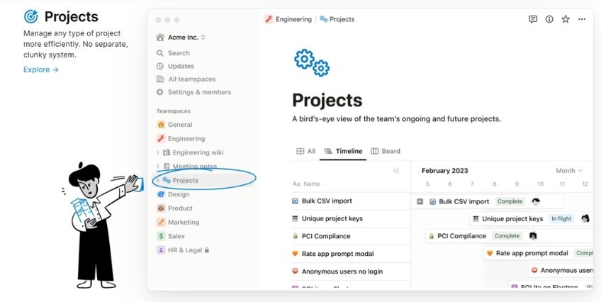
At the end of the day, Notion’s website hits where a lot of other companies miss—by making its website a literal preview of the way it looks to use the product. That’s a really bold strategy, so keep this in mind if you’re trying for a similar design.
Last words
Company websites don’t have to be robotic or boring, and they certainly don’t have to use complex interactions just to be fancy either.
The best business websites are easy to understand, especially when they’re bold and innovative. They also stay true to their mission, use clear words and pictures to guide readers, and they make honest attempts at connecting with people above all else.
With a creative approach to using the insights taken from company websites that are actually good, you also can develop a website that engages your audience and helps your brand thrive online.