When it comes to promoting your brand online to other businesses, straightforward and streamlined is a solid approach. People buying products and services for their own business usually want to cut to the chase. They don’t have time to sift through flashy features or complicated functionality to find the information they need.
Knowing this, you want the website you’re creating to showcase your product or service, not get in the way of it. A website visitor should understand within seconds what you offer and how your solution meets their needs. Here are some great B2B websites that do just that.
1. Nextiva
Nextiva is all about business communications. It’s a pretty meaty topic that can quickly overwhelm a business owner trying to find a solution to keep their teams connected.
Nextiva knows this and counters the complexity with a simplified website that takes the guesswork out of what they offer and how their products and services solve a business need.
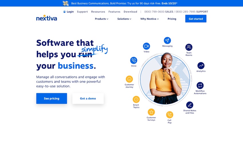
A site visitor immediately knows exactly what Nextiva offers—a simplified approach to managing all business communications.
There’s a crystal clear headline that calls out their simplified approach and a one-sentence description that explains who and how they help do it. The accompanying graphic reinforces the message with a clean, easy-to-understand breakdown of the different ways Nextiva can help.
The menu is also concise and covers all the essentials with just four choices. The contact telephone number is easy to find. The call to action of Get Started is also prominently displayed. Most importantly, Nextiva makes it simple to find out pricing, a key influencer for many businesses searching for solutions.
This simplified approach carries through across the entire Nextiva site. No matter which page you visit, you’ll see lots of white space and key information prominently called out. The images closely align with Nextiva’s purpose of helping people communicate.
What you won’t find on the Nextiva site are any unnecessary bells and whistles. Instead, you get high-quality content built around a singular concept of simplifying business communications. This is an approach that works well to provide the information a viewer needs to make an informed decision.
If you’re building a B2B site for a business that offers complex products or solutions, offset that complexity with a streamlined, straightforward approach.
2. Dropbox
One of the biggest problems any business has is how to manage the digital files and other content their teams create and collaborate on. Dropbox has built its brand around solving this issue.
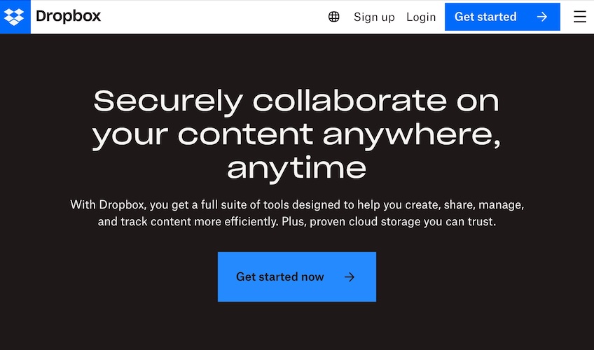
To differentiate itself from its competitors and ensure site visitors understand what makes Dropbox unique, the site leads its homepage menu with the question, “Why Dropbox?”
The question is prominently displayed in the upper left corner, which is a space the eyes naturally gravitate to when landing on any site. This gives site visitors an immediate answer to the questions they most likely have when comparing different third-party content storage solutions.
Dropbox also incorporates a lot of visual experiences on the site. This serves a couple purposes. One is that it makes the relatively dry topic of content storage more visually engaging. The other is that this approach functions like mini explainer videos, demonstrating how Dropbox solves the storage and collaboration problems without a site visitor ever reading a single word of text.
Dropbox doesn’t stop at animations and videos, though. It uses icons and simple text to further explain everything you can do with its product. You’ll find this combination of videos and explainer text, along with the bold black background/white text combination across the site. This is a site that invites engagement from its visitors, but it does so in a variety of ways to appeal to all viewer preferences.
Dropbox does make one exception to this design choice—the pricing page. This is where the multi-media aspect is non-existent. Text and simplicity is front and center, which is what you want if you’re the type of business that shares pricing with visitors up front. No matter how complex the rest of your site may be, keep your pricing page simple and easy to understand and keep your visitors satisfied.
3. Square
Square started out as a solution for even the smallest business owner to accept credit card payments. The company has since evolved into a full-service platform for point-of-sale (POS) transactions and more for small businesses.
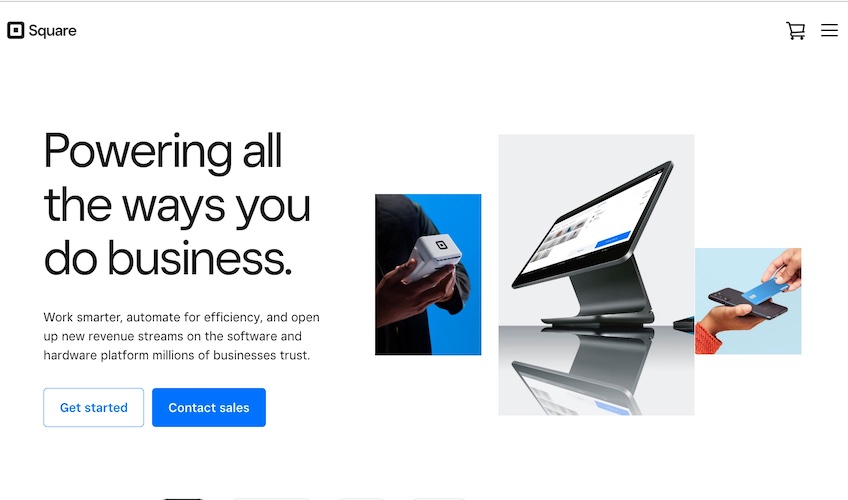
Yet despite its continued growth and expansion, Square keeps its website focused on what it does best—helping small businesses accept card payments.
The Square homepage incorporates a lot of white space which keeps the focus on the very specific images showcasing the different ways Square helps businesses accept payments. From mobile devices to POS screens to mobile apps on a smartphone, it’s clear what Square’s primary focus is and how it does it. The chosen images answer the “how” without needing a single word.
The text is equally concise, using a large font in bold black to call attention to the Square mission of helping businesses do business, which answers the “why.” The site also gives viewers an easy way to get started with a clear, large CTA button to “Get Started” just under the headline.
As you scroll down the page, Square further refines the experience by offering customization by industry type, including restaurant, retail, and beauty. These options reinforce the idea that Square remains a great solution for small businesses and mobile environments. Whether you’re an established business or a startup still looking for funding, Square makes it clear it’s a solution you can use.
The entire site uses the same style with lots of white space, black text, and images that portray typical Square customers using the products. There are no unnecessary explainer videos or multimedia experiences here, just clean design and a focus on the financial benefits of choosing Square.
If you’re designing a website for a product or service that’s for something as serious as getting paid, you can’t go wrong with a clean, distraction-free experience like this.
4. Mailchimp
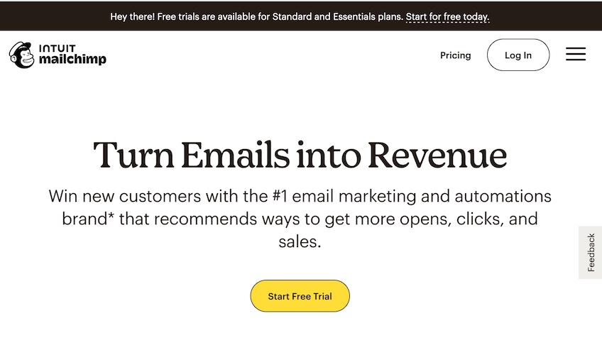
Mailchimp is synonymous with email marketing, a strategy relied on by many businesses to promote their products and services, promote events, and even ask for customer testimonials and reviews. The company has been around for decades and during that time has established itself as a leader in the space. Mailchimp doesn’t hesitate to capitalize on this standing by including its number one ranking boldly on the top of its homepage.
Mailchimp’s use of white space and easy to read black text draws attention to the words on the page. The scrolling functionality lets the company call out all the important information a potential customer might need without ever having to click a single button.
As a viewer moves down the page, the site concisely explains Mailchimp’s four major offerings, offers a product tour, and rolls straight into pricing after that—all on the homepage.
This approach gives site visitors a clear understanding of what Mailchimp can do and how much it will cost, without diving any further into the site. If a site visitor thinks Mailchimp might be a good match, they can dig deeper or start a free trial with just a click of the prominently displayed yellow CTA button that remains present throughout the website experience.
If you’re building a site for a business that has a juicy offer, like a free trial, make sure to keep that offer front and center for maximum conversions, just like Mailchimp does.
5. Procore
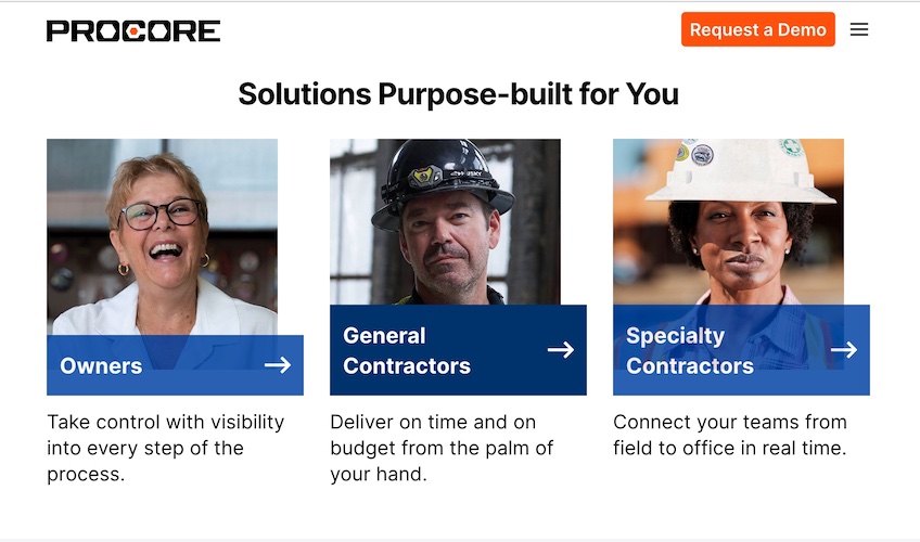
If you have a service or product that offers targeted solutions for different audiences, calling that out on your homepage is a great strategy. Procore, a construction management software company, does just that. A site visitor can quickly identify the category they fit into and quickly get information specific to them.
Once a visitor clicks on one of the boxes, Procore takes them to a page filled with information targeted to that audience. Product benefits, trust signals in the form of recognizable customer names using the product, descriptions of the different product features, return on investment statistics, and frequently asked questions give a potential customer enough information to make an informed decision.
Another piece of site design that’s also great is the ability to quickly change regions from the header found at the top of every screen. As you would imagine, a company like Procore likely has customers around the world. Giving global customers options for their site experience is priceless.
As you build your own B2B website, keep in mind your target audiences and make it easy for them to find and consume your site information with the least amount of friction as possible.
6. Monday.com
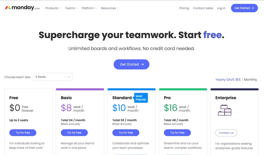
Monday is a project management tool that helps teams collaborate and optimize workflows. Its overall site is clean and well-organized, but where it really shines is on its pricing page.
Site visitors considering Monday as a possible workflow management tool can quickly make an informed decision about whether the tool meets their budget requirements. Monday incorporates a handy team size dropdown option that lets a viewer customize pricing based on how many seats (licenses) they need. It also gives the option to view pricing on a yearly or monthly basis.
Even better is that there’s a free forever version of Monday also available, plus a free trial for other plans. Even better, you don’t need to provide a credit card to get started. Monday does a great job of laying out all the different pricing options, noting what’s included with each, and making the entire table easy to understand.
The page design uses a ton of white space and black text in an easy-to-read font, and just enough color to differentiate and highlight the various plans. It’s clean, streamlined, and minimal—exactly what you want when sharing pricing information.
If you plan to include a pricing page on your B2B website, take some cues from Monday. Your future customers will thank you.
7. Zendesk
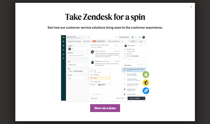
Zendesk offers customer service management software solutions for businesses of all sizes. Something the company also does is incorporate a popup window to the homepage experience for first-time site visitors.
Popup boxes are an easy way to generate leads and drive website engagement. Zendesk dials this in by offering a free demo with theirs. For a viewer new to the site, jumping into a demo may not be the first thing they think of. The Zendesk popup makes it easy to say yes, with a big purple call to action button present on a big white screen.
Once you click the purple CTA button, you’re prompted through a series of screens that ask for progressively more information to get to the demo launch button. This tactic, sometimes called the breadcrumb technique, is a proven way to build a leads database and get viewer information they may not otherwise want to give you off the bat.
As you build your B2B website, keep in mind places where you can add popups to capture this type of information. It’s a great way to accelerate your lead generation.
8. Namely
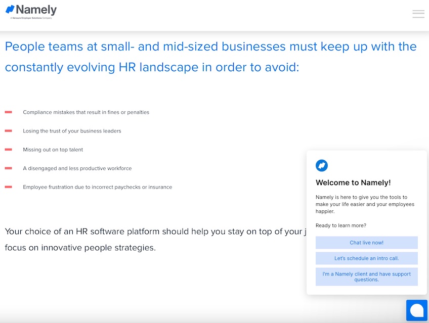
For businesses like Namely that are competing in a saturated market like human resources software, standing out can be hard. It gets easier when you adopt Namely’s approach and make it clear from the start exactly who your target market is.
For Namely, it’s small- and mid-size businesses. The company calls it out in the homepage headline, then spells out in bullet form the most common pain points for this audience.
It does all this with a clean, no frills design—lots of white space, an eye-catching blue color for the headline, and a bullet list that adds a contrasting pop of color.
This layout makes it easy to capture a reader’s attention. It also reassures site visitors they’re in the right place (small business owner) or confirms they need to look elsewhere for a solution (enterprise-level businesses).
One other thing Namely does well is including a popup chat window in the lower right corner. There are multiple options for site visitors, from live chat and scheduling an intro call to getting in touch with support for existing clients. This gives site visitors alternatives to searching the site for what they need.
When designing your own B2B site, keep in mind your target audience and then spell out how your solution solves their specific problems. Then make it as streamlined as possible for them to get answers to their questions.
9. Stripe
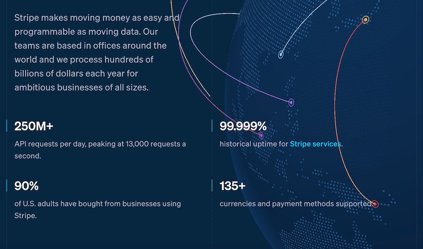
For payment processor Stripe, building trust is critical. After all, prospective customers want to be reassured that choosing Stripe won’t leave them with financial problems down the road.
Stripe makes sure future customers get this reassurance by including key information in an easy-to-read design. The color blue is associated with building feelings of trust, loyalty and confidence, so it’s a great choice for this infographic’s background.
An animated graphic showing geographic locations where Stripe operates demonstrates the reach of its services and supports the text. A table format of key statistics in white text that stands out against the dark blue background makes it easy to quickly consume the data.
Together these design elements convey the reassurance a future customer needs to feel good about choosing Stripe. And it only takes a minute to read through it all.
If you want to build trust with your site visitors, adding statistics and powerful infographics like this is a great way to do it.