
This blog discusses the important role of copywriters in menu design. It explores a common usability problem with menu design and landing pages, that copywriters can easily fix. It uses the Gov.uk menu as an example you can replicate on your government website or corporate website.
Keep content away from pages designed for navigation
You wouldn’t leave toys on the stairs for fear that someone will trip up. The same goes with leaving a trail of content on a menu landing page. By a menu landing page, I mean a page that displays when you click on a 2nd or 3rd tier menu of a fairly large website. Allow me to explain this analogy further.
Think of your main website menu as a staircase, that users travel up and down to discover content. A user-friendly menu will allow users to zip up and down quickly. It does this by stepping users through a sensible hierarchy of choices, that reflect how users think.
Content on menu pages affects usability
Some content management systems (CMS) are configured to assign a web page to each menu item (a.k.a a menu landing page). If your CMS does this, don't be tempted to fill that page with content. Some writers see the big empty page and fill it with a few paragraphs of chit-chatty content, without realising how this impairs the navigation experience.
It directly causes one of the most common issues I encounter when testing the usability of menus with 3-4 levels. Menu landing pages with too much filler content act like kids' toys left on a staircase: they can trip up users and take them wildly off-track. I’ve seen this problem time and time again, and it's easy to avoid and fix.
The purpose of a menu landing page should be to improve navigation, and not to serve up content.
Users become easily distracted or lost
When a menu landing page contains content, the reader must ask: Do I stop and read this page? Or do I ignore the content and continue clicking down the menu. Whatever the user decides, both options can be precarious.
If they stop and read, they can become easily distracted and diverted. If they ignore the content, they arrive at the bottom menu often to discover the information there is incomplete (because they overlooked the answer on a higher landing page). This causes users to lose confidence in your website. They become frustrated, clicking around aimlessly. Or even worse, they give up, wrongly believing your site does not have the answer.
When a menu landing page only provides navigation, users can make quick and confident choices to find a topic, with little reading.
Push content topics to the bottom menu tier, like Gov.uk
On a fairly complex website, a user-friendly way to design navigation is to push all your topics (content) right to the bottom rung of the menu.
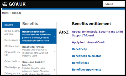
To see this concept in action, visit the Gov.uk site. Its primary navigation provides 2 to 3 simple menu tiers, some with an additional summary to clarify menu scope. Menus simply trigger sub-menus with no menu landing pages. All topic content appears on the lowest menu level — at the bottom of the staircase, so to speak.
As a writer, you will find this content-on-the-bottom menu structure also helps you focus each web page on one topic only — which is fundamental to good website content design. (This blog post on topic design explains why)
You could configure your CMS to discard menu landing pages. If you retain your menu landing pages, that's fine too. But they should only contain:
- descriptive links to the next tier of menu options
- a brief summary next to any menu label, that is not self-explanatory
- one opening sentence, summarising the menu section, for SEO purposes.
Design your topics before your menu
Oddly, website menus are often created long before content writing begins, and sometimes without much input from copywriters. But draft menus and content need to evolve together and reflect each other.
One approach to creating a robust menu is to design your content topics first — one topic per page, each focused on a user need. Then design your menu like a short staircase, that directs users, step by step, to the topics. Even better, think of yourself as designing a flight of emergency stairs or the quickest, most effective route to and from your content.
This bottom-up approach to menu design enables writers and information architects to work more effectively together to marry menus with content.
Contented.com can help you with your topic and menu design. We provide content design services and can run inhouse workshops to train web content teams in New Zealand and Australia.
#contentstrategy #contentdesign #webdesign #websitedesign #UX #userexperience #IA #informationarchitecture #menu
1 comment
Feb 20, 2019 • Posted by peter
Great post I would like to thank you for the efforts to writing this interesting and knowledgeable article.
pacific link college
Leave a comment: