The short answer to the titular question is, well, never.
It doesn’t matter how much accessibility work you’ve done, there’s always more to do—especially when new technologies and government legislation can make the standards for it a moving target.
If you’ve been working hard at making your website more accessible, it might be a bit frustrating to hear that—but focusing on accessibility is an opportunity.
By prioritizing accessibility options for your website, you’re not only creating an online space that more people can enjoy, but you’re also expanding your market reach. Plus, as an added bonus, you may even be incrementally building up your brand’s social impact.
What is Web Accessibility?
When the internet is at its best, it’s accessible to anyone, anywhere, anytime—and that includes people who face challenges during the everyday browsing experience.
Web accessibility means designing and developing websites and web technologies in such a way that people with disabilities can engage with them fully. It helps ensure the internet browsing experience meets its highest reach potential.
Accessibility includes people with any disability that could impact their ability to interact with the web. This encompasses a range of auditory, neurological, physical, speech, and visual disabilities.
People without disabilities can also benefit from an accessible website. That includes those using small screens, people with temporary ailments like a broken wrist or missing glasses, and users with slow or spotty internet connections.
Your mission as a website owner? To maintain an inclusive online environment where anybody can interact with your website, regardless of their technical or physical limitations.
According to the W3C Consortium’s Website Accessibility Initiative (WAI), the high-level goals for creating an accessible website are:
- Perceivability—Present information and user interface components so users with a wide array of sensory abilities can understand them.
- Operability—Design your website so people can navigate and interact with it using various input methods.
- Understandability—Make your content clear and digestible for people with a full range of cognitive abilities.
- Robustness—Ensure your website is compatible with all current and future technologies and assistive devices.
Why Accessibility is a Must-Have
Data shows that 61 million Americans live with disabilities, so any website that is not fully accessible risks excluding a great deal of potential visitors and losing some serious potential customers.
Beyond the business and web traffic benefits, U.S. federal and state laws mandate that business owners make their websites accessible.
For example, Title III of the Americans with Disabilities Act (ADA) requires businesses to “provide full and equal enjoyment of their goods, services, facilities, privileges, advantages, or accommodations to people with disabilities.”
If you’re wondering if Title III also applies to websites, it does. That means accessibility is not a nice-to-have. It’s a must-have.
10 Tips for Improving Web Accessibility
Whether you’ve done a lot of accessibility work in the past or are just getting ready to build a website, checking off this list of tips will ensure your visitors will feel at home on your website no matter what browsing challenges they face.
1. Write Clear and Descriptive Alt Text for Images
Alt text is one of the mainstays of accessibility, as it allows for those who can’t view images to hear descriptions about them instead. This can be used to convey the meaning of any image, such as a photo, illustration, and graph.
People with visual impairments who use screen readers can hear the alt text and understand the content without seeing it. Additionally, some users who need to increase page load times or save on bandwidth may turn off browser images, and alt text allows them to do so without losing all of the content.
Alt text is also essential for SEO purposes, as it helps search engines index your content. This makes it more likely for your content to show up in the search results due to the image descriptions that otherwise wouldn’t be there.
Good alt text typically goes beyond a simple description—it considers the context and function of an image so it can offer a similar user experience via other senses.

For example, simply using the word “bridge” as the alt text for a picturesque cityscape wouldn’t cut it. Instead, saying something like “the Brooklyn Bridge and New York City skyline lit up at night” would help users get a more complete picture.
There are two ways to add alt text. First, you can include it in your HTML code by using [ALT=” text goes here”] inside your <img> tag. Second, you can also add alt text via a visual editor, found in many of today’s best website builders.
One last tip is to add alt text only for functional images on the page. When photos are purely decorative or filler material, you can get away with leaving descriptions for those out.
2. Include Captions and Transcripts for Multimedia Content
For people with hearing disabilities, understanding narrations and dialogue in content like videos and podcasts can be tricky—unless you use captions or transcripts to make them more accessible.
Captions are text-based equivalents for speech and essential sounds in a video. They’re synchronized with the audio content and appear on the screen so people can read them and follow along with what’s being said.
Some video hosting services like YouTube provide automatic captioning, but these are not always reliable or accurate enough to be fully accessible.
Dedicated video captioning software will ensure your captions are on point. Some popular ones to consider include the following:
The addition of transcripts is not always necessary for meeting accessibility standards, but including them is a good practice that can help more people connect with your content.
If you opt to include transcripts, they should be easy to find on the page and have all the audio information necessary. In the case of video transcripts, it’s important for them to describe essential visual information for added context.
3. Integrate Keyboard Navigation
Using a mouse or a trackpad is not always a viable option for people with certain disabilities, so websites should also be navigable by keyboard alone.
Keyboard navigation works by using the tab key to move from one element to the next and pressing return or enter to click on links. With it, people can gain full access to elements like links, forms, and media player buttons, using only their keyboards.
Some of the best keyboard navigation websites include:
- Text borders or highlights to make the keyboard focus field easy to see
- Navigation that moves logically from left to right
- Drop-down menus designed for simple use via arrow keys
- Custom functions that let users avoid “keyboard traps” and escape from places they may end up accidentally.
- Well-labeled links so that users know when they will be taken to other websites.
4. Use a Logical Heading Structure
Headings are a simple way to add structure to your website, but they need proper HTML markup to make them work for people using keyboard navigation or screen readers.
Marking up headings involves using heading HTML tags such as h1, h2, and h3 for all heading text so browsers and screen readers can recognize them and react accordingly.
It’s also critical to make headings hierarchical, so be sure to arrange them in order from most to least important. For the majority of web content with logical heading structure, page titles use h1 tags, while the next highest priority sections use h2 tags. You can then use h3 or h4 tags to create sub-sections inside the h2 content blocks.
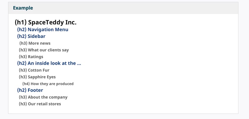
If you don’t need a lot of sections on your page, that’s fine, but it’s still a good idea to include an h1 heading to give your page a title.
5. Markup Form Labels
Along with headings, form field labels also need proper HTML markup so people using keyboards, voice commands, and screen readers can successfully navigate through them.
When labels are properly coded, keyboard users will have an easier time interacting with checkboxes and tiny buttons.
The first thing to ensure is that all form parts are accessible with a keyboard. As described in the keyboard access section, use the tab key to navigate through the form, including any drop-down menus, to check that they work.
Labels also need to go in the right places. For languages that read left-to-right, labels should sit to the left of text boxes and drop-down lists and to the right for radio buttons and checkboxes.
When coding, each form should be marked up using the ‘label’, ‘form,’ and ‘id’ tags. If you doubt your markup, you can test it with this free validator tool from W3C.
Lastly, remember to include any instructions for filling out the forms before they’re needed.
6. Optimize for Text Resizing
If your website is not optimized for different text sizes and text display options, it won’t be accessible to people who need to zoom in to make text bigger, change fonts, or increase the space between lines to read the content.
When a user changes the text size, strange things can happen. For instance, columns and sections can overlap, spaces between lines can disappear, and lines of text can become so long that users need to scroll horizontally across the entire screen to read them.
It’s easy to check how your website holds up to text resizing. First, increase the text size (push Command + plus keys on Mac Os or Windows key + plus on Windows). Then navigate through your site and double check that:
- All text gets larger and stays visible on the screen.
- Text, photos, and other elements remain separated.
- All buttons, fields, and other controls are available to use.
- Users can read sentences without having to scroll horizontally.
Perfecting the art of browser zooming and text resizing is something best left to experienced web designers. However, if you’re comfortable with coding, two tips to consider are using CSS instead of tables for your layouts, and defining the sizes and dimensions of fonts and text containers in relative units rather than fixed heights or widths.
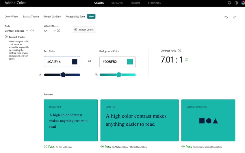
7. Use an Appropriate Contrast Ratio
No matter how snappy your web copy is, some people can’t read it without proper contrast between the text and background, also known as the contrast ratio.
For example, suppose you’re using light gray text on a white background. In that case, people with visual disabilities may be unable to read it. Instead, they need dark text on a light background or light text on a dark background.
On the other hand, people with reading disabilities may have trouble with bright or high-luminance colors. Instead, they would have an easier time with contrast ratios that are closer together, such as black text on a medium-brown background.
Most web browsers allow people to change the colors of the text and background on their own. Luckily, some free tools can also help you ensure that your site has a sufficient contrast ratio by default. Coolors and Adobe Color are two examples.
8. Go Beyond Color When Sharing Information
Color is an essential tool for building a website and creating a brand aesthetic that sparks an instant connection with visitors, but using color alone to communicate critical details can exclude people with visual impairments such as color blindness or partial vision.
A common example of how a website may communicate key information via color is when a web form says that required fields are marked in yellow, or incomplete fields are marked in red. Another example is when website signups use color to indicate the strength of a password.
A straightforward way to check for color accessibility is to review your website with the following questions in mind:
- If the colors weren’t there, would everything still make sense?
- Apart from color, what else is included to ensure people will understand essential information?
If something doesn’t add up, a simple way to build accessibility is to add text or icons for clarification, such as a password strength meter to go along with the changing colors.
9. Manage Moving or Flashing Content
Videos that play automatically, rotating ad carousels, and auto-counters are elements that can make your website pop, but they can also challenge people with visual processing disorders or those with attention deficit hyperactivity disorder (ADHD).
Since some people read and process information more slowly than others, content that moves around and changes could disappear before they register it.
Content that moves can also distract people and make it hard to focus on reading, and some may struggle to track moving objects in general. For instance, movement in one part of the page can pull their attention away from the place where they’re trying to focus.
If your site has moving, flashing, blinking, or auto-updating content, a best practice is to include controls that let users pause or hide these elements. This ensures that all users can engage with your content effectively, and it keeps you compliant with accessibility standards.
10. Test Your Site for Accessibility
Once you’ve completed your checklist of accessibility features, there are a few ways to take your newly updated website for a test run:
- Use a screen reader to navigate your website, ensuring that the content makes sense when read aloud.
- Turn off your speakers to see if the website experience works the same with or without sound.
- Try navigating around your site using only a keyboard to check if all the content is still accessible and user-friendly for keyboard-only users.
If you want to be thorough, there are a couple of software platforms that can audit your site to ensure that it’s fully accessible and compliant with legislation:
Final Thoughts
However you move forward, remember that making your website more accessible is both a challenge and an opportunity.
By making it a priority, you’re not just staying compliant with laws—you’re also building a welcoming online space that can reach more people and offer a better overall user experience.
That’s a win-win for everyone involved.