84.6% of web designers state that overcrowded page designs are the most common mistake among small businesses.
In other words, it’s better to err on the side of going too light with web design elements rather than going too heavy.
Minimalistic websites value simplicity. They include few distractions, plenty of whitespace, and contrasting colors to create a clutter-free browsing experience.
Minimalistic websites can also be easier to maintain and cheaper to build than the big honking kind. It’s a win-win situation—your visitors benefit from a seamless user experience, and you get to boost conversions without having to overcomplicate or overspend on your site’s design.
It’s also a lot easier to have a mobile-friendly website when there aren’t as many moving parts. Due to its lack of complex elements, adjusting the layout for mobile viewports is a straightforward process.
Building a minimalistic website can be done in just a few hours with the right template. Let’s take a look at some of the best minimalistic website designs from the top website builders currently available.
1. The One-Page Website
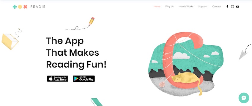
Featured template: App Landing Page from Wix.
One-page websites are self-explanatory. They only include key details that familiarize visitors with the website in question and persuade them to convert as quickly as possible.
Although it may seem counter-intuitive, one-pagers commonly use navigation menus. However, rather than leading to other subpages, these navigation links send users to different sections of the same page.
Due to their simplicity and lack of redirects, one-page websites are usually the fastest to set up and the easiest to maintain.
The one-page design is common among small company landing pages, as it includes all the information necessary about a main product or service. Coupled with the lack of additional distractions, a one-page website can boost conversions.
This design practice also works well for portfolios, event websites, or SaaS businesses, for instance.
Wix’s App Landing Page template is an excellent example. The above-the-fold section is straightforward and perfect for highlighting your unique value proposition. It includes a headline, CTA buttons, and an animated illustration. The animation is also mild—it adds life to the webpage without being too distracting.
You can use the rest of the webpage to highlight your business’s benefits and demonstrate how it works via an embedded video. You also have plenty of room for social proof by adding testimonials and trust badges.
Another notable aspect is the lead magnet at the bottom. Visitors can sign up by typing in their email address right then and there—no need to add numerous form fields or lead users to a separate webpage.
This is an excellent secondary conversion opportunity for visitors who aren’t ready to complete a primary conversion like downloading an app. You can use their email addresses to get them to convert later on with reminders.
Overall, a template like this is a perfect starting point—just add a few images, relevant copy, and you’ll have a one-page website in no time.
2. The Hero Image Website
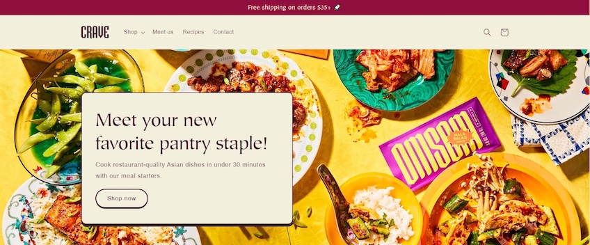
Featured template: Crave from Shopify.
Going big and bold with hero images is one of the most common web design practices today.
They are attention-grabbing and they help introduce your business to visitors without writing walls of text. They also take over most of a website’s aesthetics, which allows for a simple yet highly attractive design.
That doesn’t mean any image works, however, because unrelated stock photos can give off an unprofessional look. The image needs to be relevant to your business and convey a message. The headline and supporting copy should then complement that message with additional context.
Take Shopify’s Crave template, for instance. The hero image displays various exotic dishes. The copy then tells visitors that they can prepare similar recipes in under 30 minutes, and it invites them to check out the meal starter kits via the CTA below.
While the hero image is the center point of attention, the rest of the website should build upon it with a separate design language. As such, any design element following it should back up the ideas shown in the visuals. The Crave template does a good job of this, as the rest of the layout continues with the hero image’s color scheme and emphasizes imagery to display products.
The color scheme is also clever on its own. The pastel-based background colors, coupled with bright hues in the images, all contrast well and make the products pop out. This balance also makes the webpage more pleasant to look at, as excessive use of bright colors can be eye-straining.
Beyond all that, the template also adheres to most web design best practices. The copy is short yet effective, the navigation menu is simple and placed in a familiar spot, and the template lets the images do the talking.
As a quick sidenote, something to keep in mind if you’re using any template is to compress images before uploading them to your website. Even on a minimalistic page, unoptimized images can significantly drag down your website’s loading speed, which increases bounce rates and lowers ranking in search results.
Since 64% of mobile users expect a website to load in under 4 seconds, fast loading times are crucial for mobile-friendliness. That said, image compressors like Smush for WordPress, TinyPNG, or Compress JPEG are a must.
3. Minimalistic Blog Website
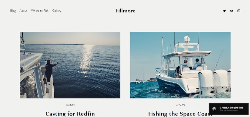
Featured template: Fillmore from Squarespace.
Blogs are quite busy by default—they tend to display large amounts of information. Add an image and headline for each post, a navigation menu, or a lead magnet, and it’s rather easy to end up with a cluttered website.
That’s why the minimalistic approach is all the more important here. Your website’s design needs to drive attention toward each displayed blog post, yet still maintain a clean layout. You need to strike a good balance between imagery, large fonts, and whitespace.
The Fillmore template from Squarespace does this perfectly.
It displays just two blogs per row. This draws equal attention to multiple posts and alleviates the effects of analysis paralysis, where users have so many choices that they have trouble picking an option.
This layout also gives plenty of room for large images, which provides additional context to each post and contributes to the page’s overall design. Moreover, the headlines are emboldened to stand out, while the supporting copy briefly captures the gist of each post.
The homepage also concludes with a lead magnet, which allows visitors to sign up for a newsletter by entering their email addresses on the spot. The navigation menu is simple, conveniently placed, and includes links to pages visitors may find useful.
Altogether, Fillmore is simply an excellent setup for your blog—its minimalistic design highlights numerous posts without cluttering your webpage and it still leaves room for an effective lead magnet.
4. Minimalistic Retail Store Website
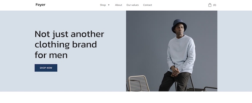
Featured template: Feyer from Hostinger.
Similar to blogs, retail store websites also need to display numerous products without cluttering the screen. Large images, effective use of whitespace, and straightforward copy help out once again.
Hostinger’s Feyer template is an excellent example. Its above-the-fold section is simple but attractive. Visitors are greeted with a catchy headline while the hero image on the right hints at the store’s products.
At the same time, the light and dark blue color scheme is soothing, and the darker shades of blue also bring out design elements like CTA buttons.
The template displays a minimalistic selection of products below the fold—which once again helps reduce choice paralysis. You can use this section to highlight popular products and sales, for instance.
Most notably, the template mentions free shipping for orders above a specific value. This is highlighted via a large, white-on-dark-blue font. This is key because 25% of shoppers abandon their carts due to unexpected shipping costs, so clarifying these things right away is essential for minimizing cart abandonment rates.
The rest of the below-the-fold content allows you to add credibility by telling a little about yourself and how your products are made. The homepage concludes with a lead magnet and a footer menu.
All in all, Feyer’s minimalist design works great for retail websites. Its emphasis on imagery and whitespace allows you to put the spotlight on your products with class and ease.
5. Minimalistic Portfolio Website
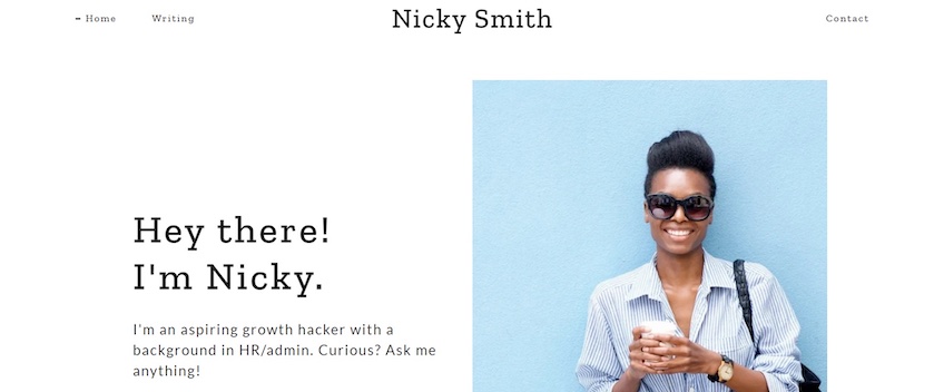
Featured template: Nicky Smith from GoDaddy.
Portfolio websites should be minimalistic and load fast so that the content is the main focus.
And since most people set up and maintain portfolio websites by and for themselves, the last thing they’d want is to deal with a headache of maintenance and downtime—especially when visitors are potential clients.
In other words, going for the minimalistic approach is a surefire way to set up a professional-looking, easy-to-deal-with portfolio website.
GoDaddy’s Nicky Smith template is an excellent example. It embraces whitespace as a key part of its design.
The hero image puts you in the spotlight and adds a splash of color. You can use the headline and supporting copy to introduce yourself, while the below-the-fold content is perfect for getting into more details and showcasing your work.
This particular template also includes a blog section—ideal for flexing your knowledge to attract new clients. You can also back up your expertise by including logos of the companies you’ve worked with previously or currently.
Potential clients can learn more about you and reach out in any way they like via embedded links. These are placed in the center of the homepage template, so they’re hard to miss. Visitors can also download your resume at the bottom-most section of the webpage.
Overall, Nicky Smith is highly straightforward and effective. Its simplistic design puts you in the spotlight and gives visitors a quick way to learn more about your expertise.
6. Minimalistic Agency Website
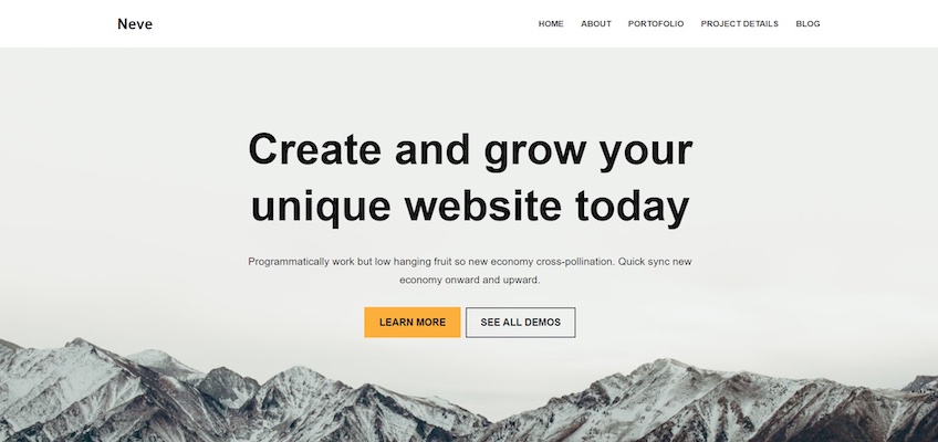
Featured Template: Neve from WordPress.
Just like portfolios, agency websites need to highlight their stand-outs and expertise as quickly as possible—it helps visitors understand what you do and why they should choose you over your competitors.
WordPress’s Neve theme is excellent for that. You can use the headline to highlight your unique value proposition, while the supporting copy can get into a little more detail about how you’ll help visitors who click on the CTAs.
A custom full-screen hero image is there to help add to your website’s aesthetics, bring out your core messaging, and strengthen your brand identity. The template then allows you to briefly highlight your company’s main benefits as soon as visitors scroll down the page—a quick way to earn their trust.
The below-the-fold layout is split into multiple sections, each presenting your agency’s services via relevant imagery and straightforward copy. You can also place CTAs next to each service section leading visitors to dedicated pages where they can learn more about the service in question.
Additionally, each of these sections has a different background color—which is excellent for improving scannability. The homepage then banks on earning the visitor’s trust with an area to display past projects and customer testimonials. You can then push for conversions by including a strong CTA beneath.
Although you can build a website similar to this template on WordPress, consider giving Bluehost a shot. Bluehost offers web hosting services specifically for WordPress. It is fast, reliable, and allows you to manage your WordPress sites on a straightforward dashboard.
Additionally, Bluehost’s WonderSuite enables you to build and customize a website—just answer a few questions regarding your website’s goals and Bluehost will suggest various templates suitable for your needs.
7. Minimalistic Event Website
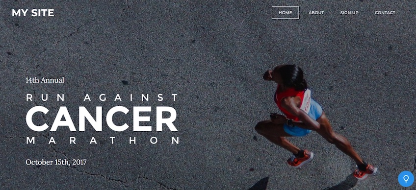
Featured template: Run from Weebly.
Event websites need to highlight essential info like event dates and locations right away. If users don’t find these details easily, they may bounce off your site.
Weebly’s Run template helps you do just that with an above-the-fold section that puts key details on the front line. Next, the hero image contributes to the page’s overall design with a stylized headline that allows visitors to get a quick sense of what the event is all about.
You can then highlight the event’s date further throughout the supporting copy. The outlined buttons in the navigation menu also make each menu item easy to spot—but not too obtrusive.
The below-the-fold section encourages visitors to register for the event or sign up as volunteers through engaging copy, supporting visuals, and strong CTAs. The homepage then gives you a bit of room to talk more about your company or foundation, its core values, and history.
This template’s subpages follow the same format as the homepage—they include large, attention-grabbing fonts and focus on images that are backed up with a bit of copy.
As a result, Weebly’s Run template requires little effort to set up, and even less work to update—simply switch the images, tweak the copy, and you’ll be all set for future events.
Conclusion
When it’s time to build your own website, remember that minimalism is all about focus, not a lack of informative content. You need to maintain the attention of your visitors—not distract them with tons of flashy graphics, animations, and other effects.
Similarly, whitespace can be used to bring out specific design elements and keep the copy concise yet engaging. Highlighting your core messaging through large fonts and attractive imagery is much easier than trying to make it stand out in a sea of noise.
Also, try to stick to a limited color palette if you can. Juggling with two or three colors helps you establish contrast in your design and bring attention to specific elements, like CTAs, without being too distracting.